Background and data
I was recently working on a project that involved how emotion regulation strategies moderate the relationship of negative affect to itself over time (moderated autoregression). In the process, I put together a type of plot that I really like and I think other people (including myself in the future) might find the code here a useful reference.
Starting with loading packages and fabricating the data (which isn’t perfect, gets a decent approximation of what I was working with in my data):
pacman::p_load(fabricatr, lme4, lmerTest, emmeans, tidyverse)

set.seed(1998.0502)
frame <- fabricate(
  id = add_level(
    N = 100, #100 people
    id.random = rnorm(100) #a random value per person
  ),
  day = add_level(
    N = 7, # one week of data
    day.random = rnorm(7) # random value per person per day
  ),
  instance = add_level(
    N = 8 # 8 obs per day
  )
) %>%
  mutate(
    # Generate NA here otherwise values are repeated
    na = rnorm(nrow( . )),
    # Columns to indicate the application of a given strategy,
    #   runif() used to generate a uniform distribution 0:1
    #   which will then be used to dichotomize later
    er.reappraise = runif(nrow( . )),
    er.accept = runif(nrow( . )),
    er.distract = runif(nrow( . )),
    er.avoid = runif(nrow( . )),
    er.suppress = runif(nrow( . ))
  ) %>%
  mutate(across(
    starts_with("er."), #hence adding those extra letters to each name
    # Assuming a regulation rate of 25% across all strategies, 5% each
    #   (probably not accurate, but go with it),
    # within that probability is 1 (selected), otherwise 0 (not selected)
    ~ ifelse( . < .05, 1, 0)
  )) %>%
  mutate(
    na.t2 = as.numeric(scale( # z-score the y variable
      # intercept
      (id.random + day.random) +
        # slopes

        # Main autoregressive effect
        .5 * na +
        # Main effects
        -.2 * er.reappraise + -.2 * er.accept + -.15 * er.distract +
        -.25 * er.avoid + -.05 * er.suppress +
        # Moderated effects
        -.4 * er.reappraise * na + -.35 * er.accept * na +
        -.2 * er.distract * na + -.45 * er.avoid * na +
        .1 * er.suppress * na +
        # error
        (rnorm(nrow( . ) + id.random + day.random))
    ))
  ) %>%
  pivot_longer( # wide format to long by strategy
    starts_with("er."),
    names_to = "strategy",
    values_to = "selected"
  ) %>%
  mutate(
    strategy = str_remove(strategy, "er."), #remove "er."
    # Then identify when a strategy was not selected
    strategy = ifelse(selected == 0, "none", strategy)
  ) %>%
  distinct() %>%
  mutate( # defining factor levels to make life easier later
    strategy = factor(strategy, levels = c(
      "none", "reappraise", "accept",
      "distract", "avoid", "suppress"
    ))
  ) %>%
  sample_frac(size = .75) # assume 25% missing data
This creates data in a long format with a row per strategy per instance per person. With real data, I create a lagged variable to represent negative affect from the adjacent sample, which is one important difference in this data. It achieves similar ends so I say it’s close enough for purposes here.
With this type of data, it can be really important to know how often a given strategy was selected. The less frequently a strategy was selected, the greater error around your estimates for the effect of that strategy and the less power for detecting such effects.
# How often was each strategy "selected"
frame %>%
  group_by(strategy) %>%
  summarize(obs = n()) %>%
  mutate(rate = (obs / nrow(frame)) * 100)

## # A tibble: 6 x 3
##   strategy     obs  rate
## * <fct>      <int> <dbl>
## 1 none        4188 79.8
## 2 reappraise   198  3.77
## 3 accept       218  4.15
## 4 distract     228  4.34
## 5 avoid        193  3.68
## 6 suppress     225  4.29
Overall a selection rate of about 20%, close to what I programmed. Roughly 200 samples per strategy, which isn’t bad. Depending on hypothesized effect sizes, that may or may not be adequate. For our purposes, it is plenty.
Now to evaluate the model!
anova(model <- lmer(
  na.t2 ~ na * strategy + (1 + na | id / day),
  data = frame, REML = FALSE
), type = "marginal")
Marginal Analysis of Variance Table with Satterthwaite's method
             Sum Sq Mean Sq NumDF  DenDF  F value    Pr(>F)
na          107.898 107.898     1  123.1 451.3583 < 2.2e-16 ***
strategy      3.940   0.788     5 4462.9   3.2964  0.005653 **
na:strategy  15.541   3.108     5 4567.6  13.0020 1.374e-12 ***
---
Signif. codes:  0 ‘***’ 0.001 ‘**’ 0.01 ‘*’ 0.05 ‘.’ 0.1 ‘ ’ 1
So two main effects and an interaction, all as expected. However, all of these need some further exploration.
# individual effects
summary(model)$coefficients %>% print(digits = 2)
# 95% CI for each
confint.merMod(model, method = "Wald") %>% print(digits = 2)
                      Estimate Std. Error   df t value Pr(>|t|)
(Intercept)             0.0064     0.0588  101    0.11  9.1e-01
na                      0.2105     0.0099  123   21.25  5.3e-43
strategyreappraise     -0.0729     0.0385 4404   -1.89  5.9e-02
strategyaccept         -0.0572     0.0368 4458   -1.55  1.2e-01
strategydistract       -0.0798     0.0359 4490   -2.22  2.6e-02
strategyavoid          -0.0987     0.0390 4458   -2.53  1.1e-02
strategysuppress       -0.0465     0.0361 4496   -1.29  2.0e-01
na:strategyreappraise  -0.2064     0.0401 4569   -5.15  2.7e-07
na:strategyaccept      -0.1496     0.0398 4613   -3.76  1.7e-04
na:strategydistract    -0.0726     0.0377 4540   -1.93  5.4e-02
na:strategyavoid       -0.1933     0.0430 4613   -4.49  7.2e-06
na:strategysuppress     0.0685     0.0361 4511    1.90  5.8e-02

                        2.5 %  97.5 %
.sig01                     NA      NA
.sig02                     NA      NA
.sig03                     NA      NA
.sig04                     NA      NA
.sig05                     NA      NA
.sig06                     NA      NA
.sigma                     NA      NA
(Intercept)           -0.1089  0.1217
na                     0.1911  0.2300
strategyreappraise    -0.1483  0.0026
strategyaccept        -0.1294  0.0149
strategydistract      -0.1502 -0.0093
strategyavoid         -0.1751 -0.0223
strategysuppress      -0.1173  0.0242
na:strategyreappraise -0.2849 -0.1278
na:strategyaccept     -0.2276 -0.0717
na:strategydistract   -0.1464  0.0013
na:strategyavoid      -0.2776 -0.1090
na:strategysuppress   -0.0022  0.1391
From this, it is pretty clear that negative affect has a positive autoregressive effect (beta = 0.21) and it looks like most strategies significantly attenuate this effect relative to no strategy. What about between them?
emtrends(
  model, pairwise ~ strategy,
  var = "na",
  #Next two are due to DF calculation
  lmerTest.limit = 15500,
  lmer.df = "satterthwaite"
)
This will provide pairwise contrasts of the slope of negative affect on the outcome (negative affect at time 2) for each strategy. The contrasts relative to “none” should actually be the same estimates as in the model coefficients for negative affect X Strategy (although the directions are different).
$emtrends
 strategy   na.trend      SE   df lower.CL upper.CL
 none         0.2105 0.00991  123   0.1909   0.2302
 reappraise   0.0042 0.03973 3869  -0.0737   0.0821
 accept       0.0609 0.03948 3916  -0.0165   0.1383
 distract     0.1380 0.03731 3660   0.0648   0.2111
 avoid        0.0172 0.04272 4097  -0.0665   0.1010
 suppress     0.2790 0.03566 3546   0.2091   0.3489

Degrees-of-freedom method: satterthwaite
Confidence level used: 0.95

$contrasts
 contrast              estimate     SE   df t.ratio p.value
 none - reappraise       0.2064 0.0401 4569  5.149  <.0001
 none - accept           0.1496 0.0398 4613  3.762  0.0024
 none - distract         0.0726 0.0377 4540  1.926  0.3864
 none - avoid            0.1933 0.0430 4613  4.494  0.0001
 none - suppress        -0.0685 0.0361 4511 -1.899  0.4025
 reappraise - accept    -0.0567 0.0554 4589 -1.024  0.9101
 reappraise - distract  -0.1338 0.0538 4566 -2.485  0.1286
 reappraise - avoid     -0.0130 0.0579 4607 -0.225  0.9999
 reappraise - suppress  -0.2748 0.0527 4537 -5.214  <.0001
 accept - distract      -0.0771 0.0538 4572 -1.434  0.7064
 accept - avoid          0.0437 0.0572 4614  0.763  0.9736
 accept - suppress      -0.2181 0.0525 4575 -4.155  0.0005
 distract - avoid        0.1207 0.0561 4566  2.151  0.2611
 distract - suppress    -0.1411 0.0512 4484 -2.757  0.0648
 avoid - suppress       -0.2618 0.0550 4581 -4.763  <.0001

Degrees-of-freedom method: satterthwaite
P value adjustment: tukey method for comparing a family of 6 estimates
Plot
Now, this would be a lot to describe in text, so let’s design a figure. Particularly for a plot like this that would have a lot going on, it can be helpful to choose a color scheme you like.
# I like this pallet and it is color-blind safe
RColorBrewer::display.brewer.pal(6, "Paired")
(colors_strategy <- setNames(
  RColorBrewer::brewer.pal(6, "Paired"),
  # I want none, the reference to be the last color,
  #   so I took it out then added it on at the end here
  c(levels(frame$strategy)[-1], "none")
))
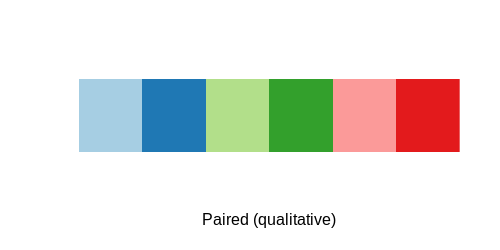
reappraise     accept   distract      avoid   suppress       none
 "#A6CEE3"  "#1F78B4"  "#B2DF8A"  "#33A02C"  "#FB9A99"  "#E31A1C"
This is not the type of plot that can be created (easily) from the raw data, so I use the model data to create it:
plot_frame <- emtrends(
  model, pairwise ~ strategy,
  var = "na", lmerTest.limit = 15500,
  lmer.df = "satterthwaite"
)$emtrends %>% data.frame
That would make a fine plot, but I also find it really useful to put relevant contrasts into the plot. We could focus just on the contrasts between each strategy and no strategy, which is relatively easy. However, to make things more interesting (and so that a single figure says as much as it can), let’s include the pairwise contrasts too.
plot_contrast <- emtrends(
  model, pairwise ~ strategy,
  var = "na", lmerTest.limit = 15500,
  lmer.df = "satterthwaite"
)$contrasts %>% data.frame %>%
  # split contrast column to make it more useful
  separate(contrast, into = c("ref", "strategy"),
           sep = " - ") %>%
  mutate(
    t = round(t.ratio, 2),
    p = cut(p.value, breaks = c(-Inf, .001, .01, .05, Inf),
            labels = c("***", "**", "*", "")),
    effect = paste("\U1D635 = ", t, p, sep = ""),
    ref = factor(ref, levels = c(
      "none", "reappraise", "accept", "distract", "avoid"
    )),
    # set unique intercepts based on the reference strategy
    # It is really hard to know these ahead of time,
    #   I looked at the plot then made these to fit
    y.intercept = (9 - as.numeric(ref)) / 10
  )
We have all the data (plot_frame) and the labels (plot_contrast) ready, so let’s bring it together.
# useful for a particular visual feature I like
ref_band <- plot_frame %>% filter(strategy == "none")

ggplot() +
  # I like showing a reference. 0 is generally a good one, but here
  #   using "none" makes more sense
  geom_rect(
    data = ref_band,
    mapping = aes(
      ymax = upper.CL, ymin = lower.CL,
      xmin = -Inf, xmax = Inf
    ), alpha = .05, fill = colors_strategy["none"]
  ) +
  geom_hline(yintercept = ref_band$na.trend,
             color = colors_strategy["none"]) +
  geom_pointrange(
    data = plot_frame, size = 1,
    # Here I plot using CL, but you could do SE instead
    aes(x = strategy, y = na.trend, ymin = lower.CL, ymax = upper.CL,
        color = strategy),
  ) +
  geom_label(
    data = plot_contrast,
    aes(
      y = y.intercept, x = strategy, label = effect, color = ref
      # if you don't replace the color, then it gets really confusing
    ),
    show.legend = FALSE # I don't like the label legend so I hide it
  ) +
  scale_color_manual(
    values = colors_strategy, labels = c(
      "None", "Reappraisal", "Acceptance", "Distraction",
      "Avoidance", "Suppression"
    )
  ) +
  scale_x_discrete(labels = c(
    "None", "Reappraisal", "Acceptance", "Distraction",
    "Avoidance", "Suppression"
  )) +
  theme_minimal() +
  labs(
    y = "Autoregressive effect of negative affect",
    x = "Strategy", color = "Strategy"
  )

